Let’s talk about colors. What’s the difference between CMYK and RGB?
For starters, they both describe colors. CMYK (which stands for Cyan, Magenta, Yellow and Key) is known as a subtractive color model, meaning that as colors are added to each other, the result is closer to black. RGB (Red, Green and Blue) is an additive color model, where as you add colors together, the result gets closer to white.
Each CMYK value stands for a percentage of the respective color used in the final print. RGB colors use different values depending on the medium. For example, the average screen uses values from 0-255 (0 being no light and 255 being the most light) and combine to create millions of colors.
To simplify, printers use CMYK colors while photography and video use RGB. You may have noticed that a printer’s ink cartridge lists CMY or K colors when you buy a refill. This is because they print in layers, laying down each color in sequence until the final color is shown. Alternatively, computer screens use light to display colors and they can create almost any color.
To get a better understanding of RGB colors, try this:
- Open Microsoft Word and insert a shape into your document.

- Right click on the shape and go to “Format Shape”.
- Under “Fill”, go to “Solid”, drop down the “Color” option and select “More Colors”.
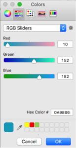
- You’ll get a second pop-up with various color options. Find the one that has three sliders (red, green and blue sliders – get it?!). Make sure “RGB Sliders” is selected.
- From there, you can play with the levels of Red, Green and Blue in your color to create new options.
What about Pantone colors?
Pantone colors are another thing altogether. Pantone (or PMS: Pantone Matching System) colors are used by printers to standardize color production. If you’re using PMS colors, you’re guaranteed to have them match as long as they’re printed on the same kind of paper. (Matte vs. glossy paper finishes might affect the color just slightly).

Fun Fact: Every year Pantone selects a “Color of the Year”. For the first time ever, 2016’s color is actually TWO colors – the combination of Rose Quartz & Serenity (PANTONE 13-1520 & PANTONE 15-3919)
—
The Beginner’s Guide to Graphics a four-part series. Read on to learn more!
